In the questions below, use R code to answer questions. For any non-coding questions, give your answer as a comment.
Run this code chunk first, to make the data set from the code along is available as the variable sick:
library(tidyverse)
── Attaching core tidyverse packages ──────────────────────── tidyverse 2.0.0 ──
✔ dplyr     1.1.4     ✔ readr     2.1.5
✔ forcats   1.0.0     ✔ stringr   1.5.1
✔ ggplot2   3.5.1     ✔ tibble    3.2.1
✔ lubridate 1.9.3     ✔ tidyr     1.3.1
✔ purrr     1.0.2
── Conflicts ────────────────────────────────────────── tidyverse_conflicts() ──
✖ dplyr::filter() masks stats::filter()
✖ dplyr::lag()    masks stats::lag()
ℹ Use the conflicted package (<http://conflicted.r-lib.org/>) to force all conflicts to become errors
sick<-read_csv("sick_data.csv")
Rows: 349 Columns: 10
── Column specification ────────────────────────────────────────────────────────
Delimiter: ","
chr (4): last, first, sex, specialties
dbl (6): age, height_cm, weight_kg, perc_fish, perc_plant, doctor_trips

ℹ Use `spec()` to retrieve the full column specification for this data.
ℹ Specify the column types or set `show_col_types = FALSE` to quiet this message.
What does “gg” in “ggplot” stand for? What are the three components of data visualizations?
# GG stands for "Grammar of Graphics"# The three components of data visualizations are:# The Data# The Aesthetics (the stuff you see)# The Geom, or type of plot
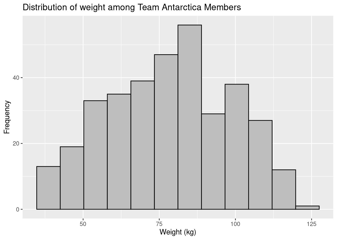
Create a histogram of the distribution of team member weights with ggplot. Make sure you add descriptive labels.
ggplot(data=sick, mapping=aes(x=weight_kg))+geom_histogram(bins=12, color="black", fill="grey" )+labs(title="Distribution of weight among Team Antarctica Members", y="Frequency", x="Weight (kg)")
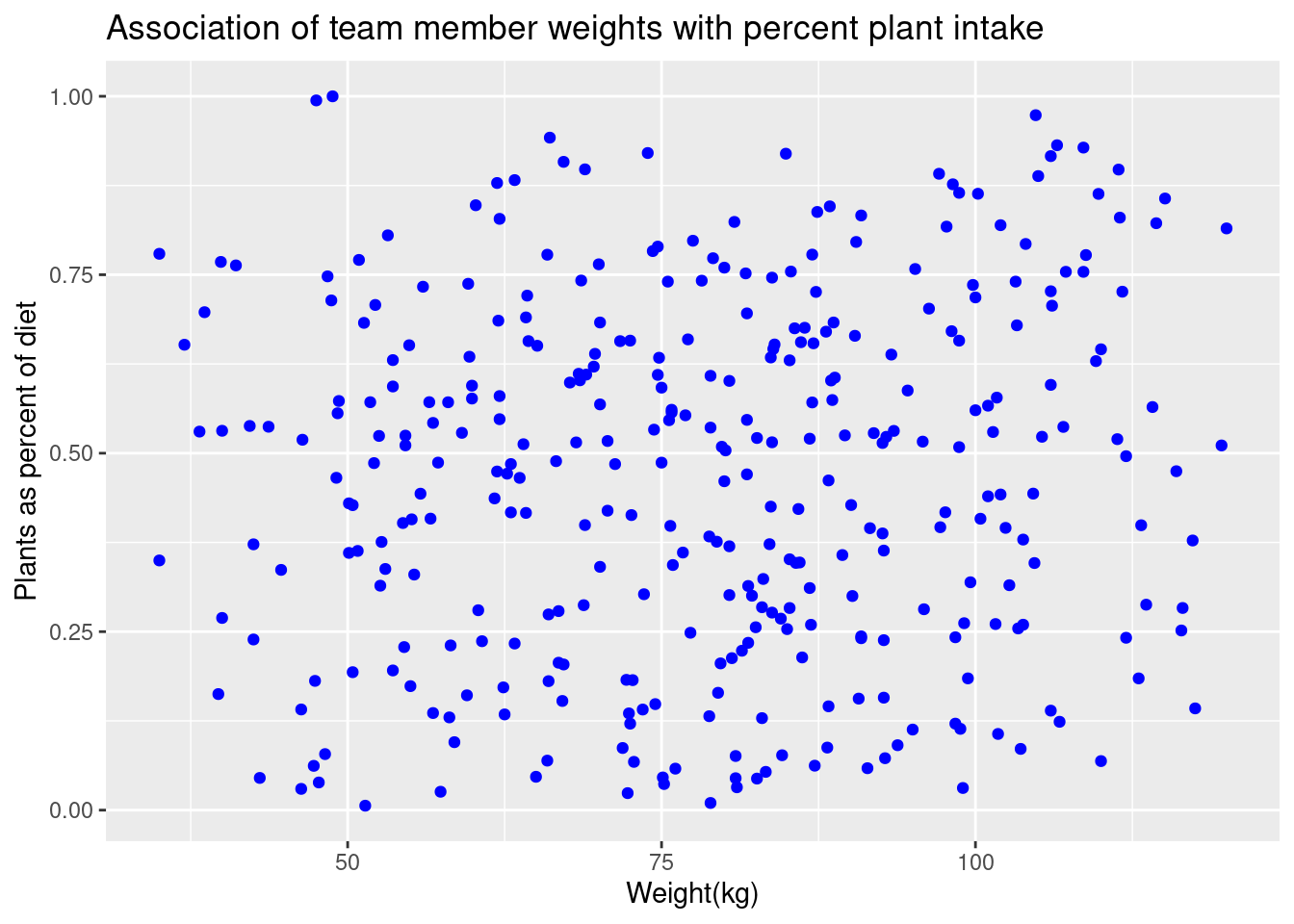
Create a scatter plot displaying participant weight with percent plant intake using ggplot. Label axes appropriately.
ggplot(data=sick, mapping=aes(x=weight_kg, y=perc_plant))+geom_point(color="blue")+labs(title="Association of team member weights with percent plant intake", x="Weight(kg)", y="Plants as percent of diet")
Describe why you might use a histogram, scatter plot, or bar plot (i.e. what is the purpose of each?).
# You would use a histogram to show frequency distribution for a single variable in a population.# You would use a scatter plot to view associations (or lack thereof) between two numeric variables.# You would use a bar plot to compare averages (or other statistical measures) among groups
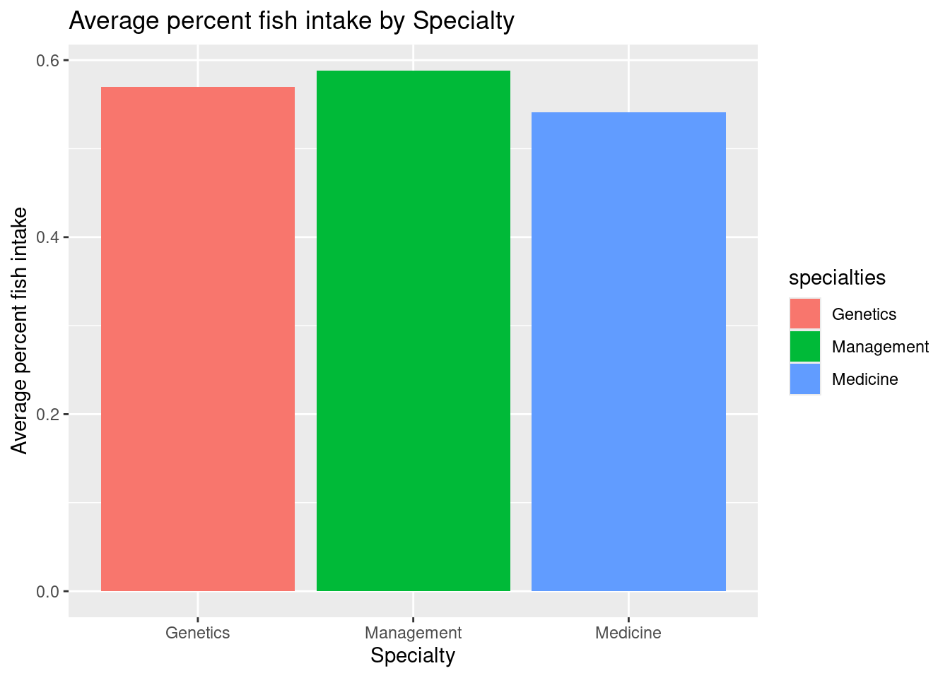
Generate a bar plot showing the average fish consumption among those who specialize in Management, Genetics, and Medicine. Include labels, and use the “fill” attribute to generate colors and a legend.
fishConsumption<- sick %>%filter(specialties=="Management"| specialties=="Genetics"| specialties=="Medicine") %>%group_by(specialties) %>%summarize(avgFishConsumption=mean(perc_fish))ggplot(data=fishConsumption, mapping=aes(x=specialties, y=avgFishConsumption, fill=specialties))+geom_bar(stat="identity")+labs(title="Average percent fish intake by Specialty", x="Specialty", y="Average percent fish intake")
For each of the three plots above, write code to save the files to “histogram.jpg”, “scatterplot.jpg”, and “barplot.jpg”. (Hint: assign each plot to a variable as part of your answer)
#histogramhgram<-ggplot(data=sick, mapping=aes(x=weight_kg))+geom_histogram(bins=12, color="black", fill="grey" )+labs(title="Distribution of weight among Team Antarctica Members", y="Frequency", x="Weight (kg)")ggsave("histogram.jpg", hgram)
Saving 7 x 5 in image
#scatterplotsplot<-ggplot(data=sick, mapping=aes(x=weight_kg, y=perc_plant))+geom_point(color="blue")+labs(title="Association of team member weights with percent plant intake", x="Weight(kg)", y="Plants as percent of diet")ggsave("scatterplot.jpg", splot)
Saving 7 x 5 in image
#bar chartbarchart<-ggplot(data=fishConsumption, mapping=aes(x=specialties, y=avgFishConsumption, fill=specialties))+geom_bar(stat="identity")+labs(title="Average percent fish intake by Specialty", x="Specialty", y="Average percent fish intake")ggsave("barplot.jpg", barchart)