First we need to load the penguin data set, just like we have before. The data set will be called penguins This data was collected by real scientists! Data were collected and made available by Dr. Kristen Gorman and the Palmer Station, Antarctica LTER, a member of the Long Term Ecological Research Network.
# A tibble: 344 × 8
   species island    bill_length_mm bill_depth_mm flipper_length_mm body_mass_g
   <fct>   <fct>              <dbl>         <dbl>             <int>       <int>
 1 Adelie  Torgersen           39.1          18.7               181        3750
 2 Adelie  Torgersen           39.5          17.4               186        3800
 3 Adelie  Torgersen           40.3          18                 195        3250
 4 Adelie  Torgersen           NA            NA                  NA          NA
 5 Adelie  Torgersen           36.7          19.3               193        3450
 6 Adelie  Torgersen           39.3          20.6               190        3650
 7 Adelie  Torgersen           38.9          17.8               181        3625
 8 Adelie  Torgersen           39.2          19.6               195        4675
 9 Adelie  Torgersen           34.1          18.1               193        3475
10 Adelie  Torgersen           42            20.2               190        4250
# ℹ 334 more rows
# ℹ 2 more variables: sex <fct>, year <int>
library(tidyverse) # to make tidyverse commands available
── Attaching core tidyverse packages ──────────────────────── tidyverse 2.0.0 ──
✔ dplyr     1.1.4     ✔ readr     2.1.5
✔ forcats   1.0.0     ✔ stringr   1.5.1
✔ ggplot2   3.5.1     ✔ tibble    3.2.1
✔ lubridate 1.9.3     ✔ tidyr     1.3.1
✔ purrr     1.0.2
── Conflicts ────────────────────────────────────────── tidyverse_conflicts() ──
✖ dplyr::filter() masks stats::filter()
✖ dplyr::lag()    masks stats::lag()
ℹ Use the conflicted package (<http://conflicted.r-lib.org/>) to force all conflicts to become errors
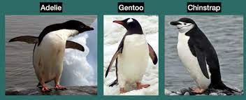
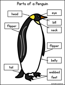
There are three different species of penguins in this data set. We can see from the photo below that they may have different body dimensions. We will be using data visualizations to explore some of these differences.
Remember
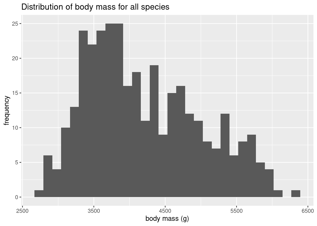
Create a histogram of body mass for all penguin species. Using comments, write a description of what this histogram shows.
ggplot(data = penguins, mapping=aes(x=body_mass_g)) +geom_histogram() +labs(title="Distribution of body mass for all species", x ="body mass (g)", y ="frequency")
`stat_bin()` using `bins = 30`. Pick better value with `binwidth`.
Warning: Removed 2 rows containing non-finite outside the scale range
(`stat_bin()`).
# this histogram shows a distribution of the variable body_mass_g
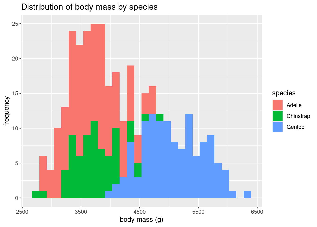
Create a histogram of body mass, with each species in a different color. What does this show us about the different species? Which species do you think has the greatest body mass?
ggplot(data = penguins, mapping=aes(x=body_mass_g, fill=species)) +geom_histogram() +labs(title="Distribution of body mass by species", x ="body mass (g)", y ="frequency")
`stat_bin()` using `bins = 30`. Pick better value with `binwidth`.
Warning: Removed 2 rows containing non-finite outside the scale range
(`stat_bin()`).
# Gentoo tend to have a larger body mass than Adelie and Chinstrap penguins.
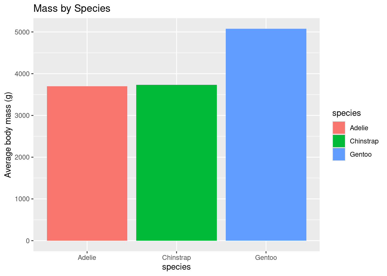
Now let’s find out! Create a bar graph with the average body mass for each penguin species. (Don’t forget about the NAs in the data set) Which one has the greatest average body mass? How does that compare with what you thought looking at the histogram?
penguinMass <- penguins %>%group_by(species) %>%summarize(avgMass =mean(body_mass_g, na.rm=TRUE))ggplot(data=penguinMass, mapping=aes(x=species, y=avgMass, fill = species)) +geom_bar(stat="identity")+labs(title="Mass by Species", y ="Average body mass (g)", x ="species")
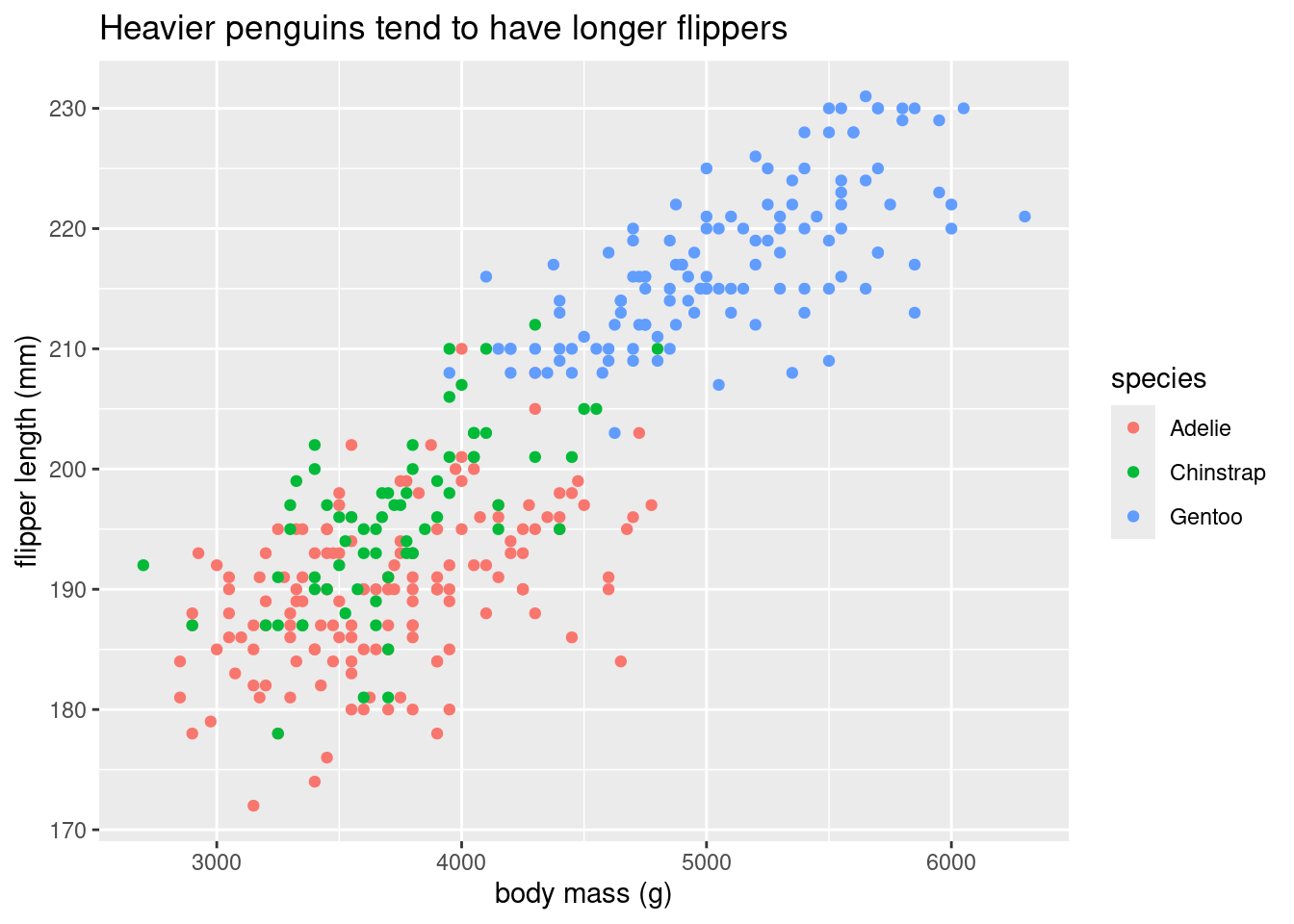
Create a visualization that will help answer the question: Do heavier penguins have longer flippers? Think about how many variables you have and the best way to present this data. Color by species.
ggplot(data = penguins, mapping =aes(x=body_mass_g, y = flipper_length_mm, color = species)) +geom_point() +labs(title ="Heavier penguins tend to have longer flippers", x ="body mass (g)", y ="flipper length (mm)")
Warning: Removed 2 rows containing missing values or values outside the scale range
(`geom_point()`).
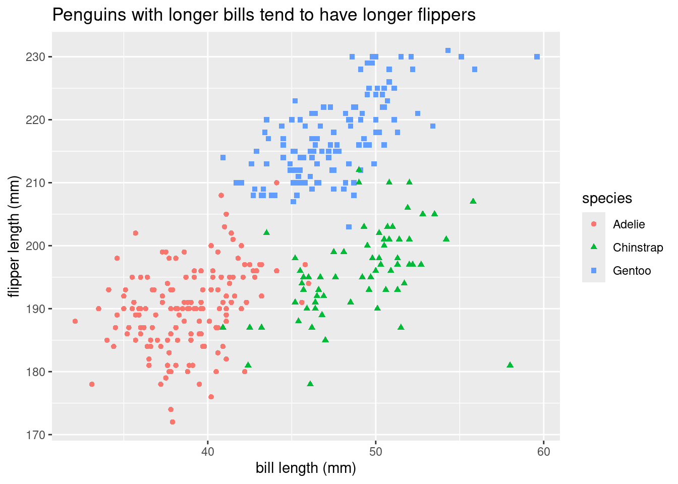
Create a data visualization to explore the question: Do penguins with longer bills tend to have longer flippers as well? Make sure to give the points either different colors or shapes based on the species.
ggplot(data = penguins, mapping =aes(x=bill_length_mm, y = flipper_length_mm, shape = species, color=species)) +geom_point() +labs(title ="Penguins with longer bills tend to have longer flippers", x ="bill length (mm)", y ="flipper length (mm)")
Warning: Removed 2 rows containing missing values or values outside the scale range
(`geom_point()`).
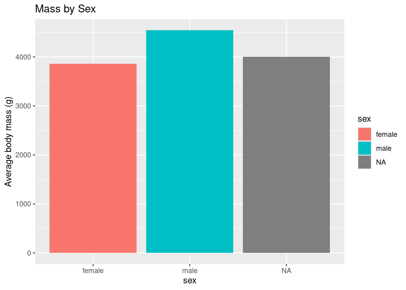
Create a bar graph that shows the average body mass by sex.
penguinMassBySex <- penguins %>%group_by(sex) %>%summarize(avgMass =mean(body_mass_g, na.rm=T))ggplot(data=penguinMassBySex, mapping=aes(x=sex, y=avgMass, fill = sex)) +geom_bar(stat="identity")+labs(title="Mass by Sex", y ="Average body mass (g)", x ="sex")
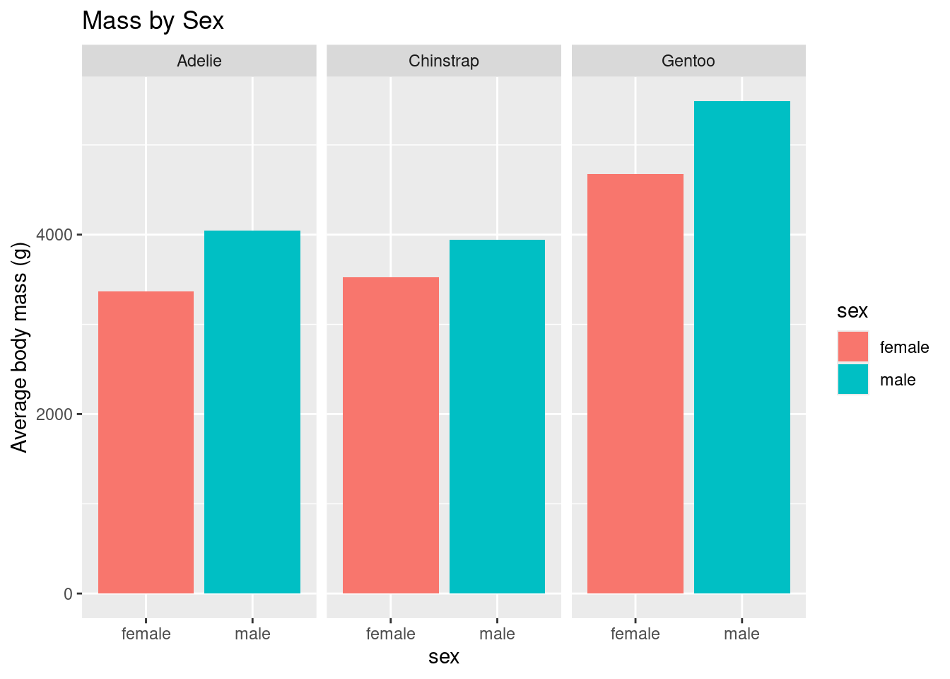
Create one figure that has three bar graphs: comparing average body mass by sex AND species. If you need a hint, please ask!
`summarise()` has grouped output by 'sex'. You can override using the `.groups`
argument.
ggplot(data=penguinMassBySexAndSp, mapping=aes(x=sex, y=avgMass, fill = sex)) +geom_bar(stat="identity") +labs(title="Mass by Sex", y ="Average body mass (g)", x ="sex") +facet_wrap(~ species)
Think about how many variables you are graphing (one or two), what kind of variables they are (categorical or numerical), and what question your viz will explore!
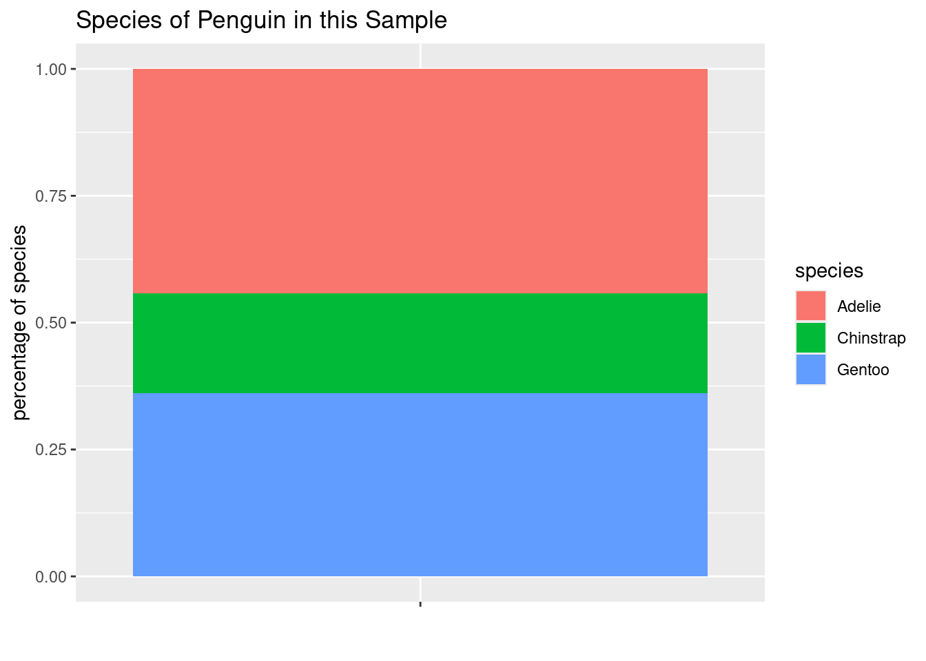
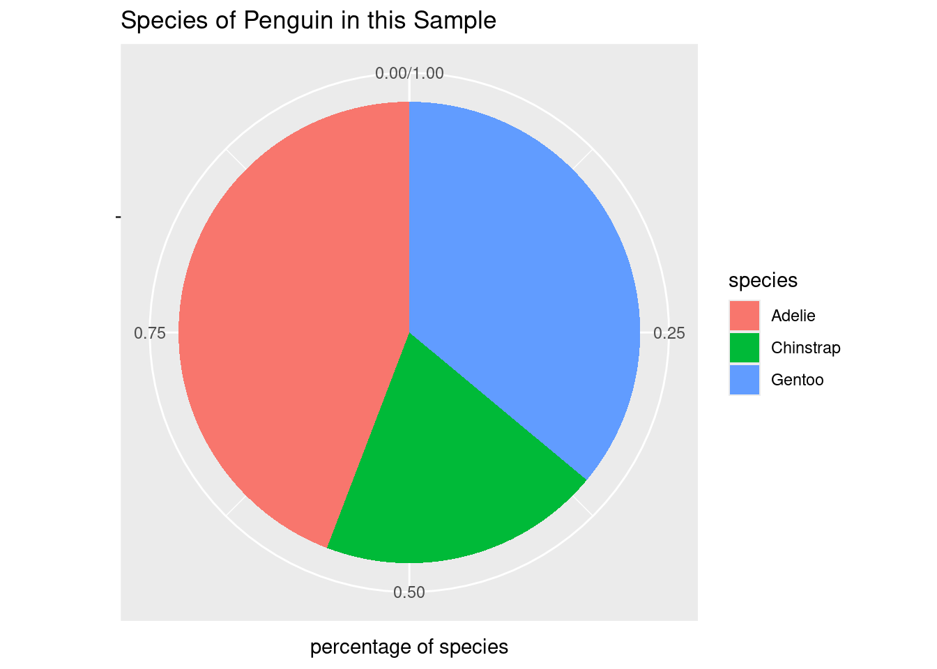
Create a a pie chart, showing the percentage of the data set each penguin species comprises. (you definitely will need to use google). In data science, are pie charts a good idea? Take a look here, and explain your answer.
# first we need to calculate the number of penguins of each species in the datasetpenguinCounts <- penguins %>%group_by(species) %>%summarise(number =n())penguinCounts
# A tibble: 3 × 2
  species   number
  <fct>      <int>
1 Adelie       152
2 Chinstrap     68
3 Gentoo       124
# now we need to divide each of those by the total to get the percentagepenguinCounts$perc <- penguinCounts$number /nrow(penguins)penguinCounts
# A tibble: 3 × 3
  species   number  perc
  <fct>      <int> <dbl>
1 Adelie       152 0.442
2 Chinstrap     68 0.198
3 Gentoo       124 0.360
# now we can first make a bar plot with the datapenguinBP <-ggplot(penguinCounts, aes(x="", y=perc, fill = species)) +geom_bar(width=1, stat ="identity") +labs(title="Species of Penguin in this Sample", x="", y="percentage of species")penguinBP
# and finally change that to a pie chartpenguinPieChart <- penguinBP +coord_polar("y")penguinPieChart
# Generally speaking, pie charts aren't a great choice for data visualizations, because humans aren't good and comparing shapes with angles. Differences in bar charts are much easier for humans to interpret.