AQI Part 1 - Introduction to Data Science
Introduction
Welcome to this lesson on air quality! We’ll be using data science to learn about air quality. This tutorial will introduce coding to help you better understand air quality. Advance through the tutorial by clicking the blue “Continue” buttons. By the end of the tutorial, you will see how to create an air quality graph.
Note, this is Part 1 of the air quality tutorials. In Part 2, you will be able to customize air quality graphs for any location you choose! Click here to navigate to Part 2 now.
First, let’s learn about air quality. Check out this video to learn more about how air quality affects us.
Click “Continue” to move to the next section.
Data Science
What is data?
Data is large amounts of information that you collect. Often, it looks like a lot of numbers that are collected to describe some phenomenon.
For example, if you measure the temperature every day in one location for one year, you would have created data. You can then use data science to analyze that data.
What is data science?
- Data science is the ability to synthesize data and derive meaningful information. Often, graphs, maps, models, and charts are used to help understand data and display information.
Stop and think
What is an example of data?
✓The age and grade of everyone in your school
✓The favorite restaurant of everyone who walks down your street
✓The pm2.5 data for every day in 2023 in Portland
✓All of the above
Using the computer to do data science
In this tutorial, we’re going to use coding to analyze large amounts of data. We’ll be able to create graphs by writing code.
We’re going to use a coding language called R. Basically, “R” is a collection of commands that the computer understands. You can tell the computer one of the commands and it will know to do something.

Introduction to R
This tutorial lets you use R to work with data. Throughout the tutorial, there are gray boxes with a green “run code” button. These are called code chunks. You can type commands into these boxes and it will output answers. Let’s try it out.
One command the computer knows is multiplication! Try typing 5*3 in the box right below this. Then press the green play button that says “run code”.
Press run code
Did you see the number 15 pop out?
Here’s another code chunk you can try typing something into. Maybe you want to try a division problem? Or maybe you want the computer to say hello to you? There’s a few different tabs you can click on to learn how to do cool things!
Want to try out your own code? Maybe another math problem? Here’s a place to do that. Otherwise click on the tabs to learn something new!
Would you like the computer to say hello to you?
First, type your name where the blank _______ is, in the second code chunk. Don’t delete the quotation marks.
Here’s an example:
Now your turn. Type your name instead of the blank _____ and then click play:
We can use r to find the largest number in a long list of numbers. To try this out, type a bunch of numbers inside the parentheses (______). Separate your numbers with a comma. Don’t delete anything else!
Here’s an example:
Now you try. Type your numbers after the first parenthesis and separate them with a comma. Then click run code.
Now let’s run a function that will tell us which number is the biggest. Click the play button on this code chunk too.
Looking at Data through Star Wars!
We can use R to look at all kinds of data. Let’s look at Star Wars. First we can get a table of all of the characters and columns with descriptions about them.
Press run code
You’ll probably see a lot of confusing words. But can you recognize some names of characters?
Selecting Data
If we want to look at just one column of data, we can use the select function. Let’s just look at all of the names of characters. We can use the select function to show us that.
Press run code
Hopefully, you see some names of star wars characters! Is your favorite character displayed? You may notice that not all of the characters are displayed. That’s because it’s too long of a list, so the computer shortens it so it doesn’t take up the whole page.
Filtering Data
To find data with a certain characteristic, we can use the filter function. For this example, we will find all of the Star Wars characters who are from Tatooine!
Press run code
Counting Data

Maybe we want to find the number of characters who are Droids! The count function will let us get a numerical value for the specific column we are looking at.
Press run code
Our data
Today, we’ll be looking at air quality data from the EPA. It contains data that was collected nearly every day for 23 years (2000-2023). It calculates the air quality index based on the PM 2.5 levels.
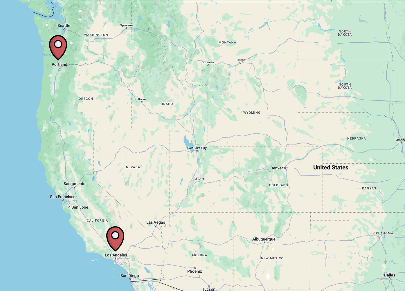
We’re focusing on Portland and Los Angeles air quality data.

Image from https://cleanairenc.org/ blog/2017/02/16/ north-carolinas-air-quality/

Click the blue box below to view the data.
Warning in instance$preRenderHook(instance): It seems your data is too big for
client-side DataTables. You may consider server-side processing:
https://rstudio.github.io/DT/server.htmlWow that’s a lot of data! It’s pretty hard to get any meaningful information from just that table of information. Luckily, we can use R to better understand it and make graphs!
Before we use R, though, let’s try to understand a bit of what’s going on.
At the top of the table, there are bolded words. These are column titles and refer to the variable names that are collected when measuring air quality.
Underneath the variable names, you’ll see individual entries for the data.
At the very bottom of the data table, you can click to different pages of data and see how many total entries there are.
Stop and think
How many data entries are there in the Los Angeles data?
✓8,594 data entries
✗8,744 data entries
✗10 data entries
✗100 data entries
What was the PM2.5 AQI Value in Portland on 01/01/2000?
✗158
✗62
✓49
✗100
Data location
Let’s find out exactly where the air quality data was recorded. If you look at the data table, are you able to find all the locations (sites) in Portland where they recorded the air quality?
This is a pretty hard task, as it requires you to look through all the data and find all the different site names. Luckily, we can use the computer to quickly check how many locations there are.
The R command
unique()outputs all the unique data entries in one column. In other words, it will tell us all the different entries the Site Name column.
Press run code below. If you want to learn more about the code, click “Learn more”!
The command we used is
portland_AQIspecifies the data we’re looking at. In this case,portland_AQIis the name of our data frame - it contains all the data in the Portland table you saw above.- The name for the Los Angeles data is
la_AQI. It contains all the data in the Los Angeles table you saw above.
- The name for the Los Angeles data is
The
$tells R to find a column name.Site.Nameis the name of the column we want to look at, as it contains the locations
Can you figure out the names of the Los Angeles locations where they measured air quality data?
Edit the code below so that it outputs Los Angeles site names.
Hint: You’ll need to change the part of the code that says portland_AQI. What’s the name of the Los Angeles data set?
Do you recognize any of the site names? Are any close to where you live?
Graphing our data
Now that we understand what the data table contains, let’s try to graph it and better understand what it means.
Our goal is to make a graph of the overall air quality in Portland and Los Angeles by describing how healthy or unhealthy the air is.
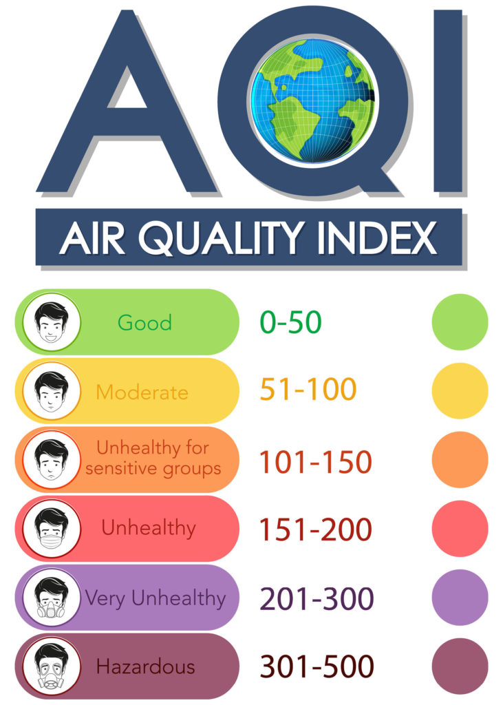
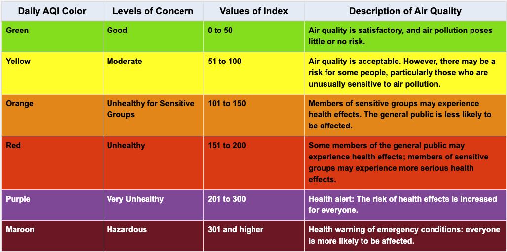
The EPA defines the following categories based on the air quality index (AQI):

We’ve inputted these values and colors into our code for the graph.
You may have noticed that if you go to the EPA website, they have options to generate a graph right there! So why would we make our own graph? Well, they have pretty limited options for what type of graph you can create and what variables you can choose. If we use R (coding), we have lots more options for types of graphs!
AQI Tile Plot
We’ll start by making a tile plot for the air quality index (AQI) from 2000-2023. Let’s see what the graph looks like for Portland and Los Angeles. Later on, you’ll have options to create other types of graphs for more locations.
Press run code below. Then, click through the tabs at the top of the code chunk to make a tile graph for Los Angeles.
Run Code button not working: Make sure you wait until the green circle at the very top of this page says “Ready!” We have some code running in the background and the green circle indicates it has finished running.

Error message: Did you accidentally delete or change some code? Click the refresh button at the top of the code cell and try running it again.
Stop and think
Talk with your neighbor about the graphs!
What do you notice?
What do you wonder?
What is different between the two graphs?
- Why are they different?What else would you like to know?
If you are using the corresponding slides for this lesson, you’ll notice that the graphs in slides 28 and 30 look different than the graphs you made in this tutorial. The reason for this is a bit complicated, but I’ll try to explain below. In short, the graphs in this tutorial and the EPA graphs are correct, but the EPA should do a better job labeling their graphs - their legend is very misleading!
The graphs in the slides were made from the same data as the EPA used and as we used in this tutorial. So why would they look different?
Well, if you look at the legend on the EPA graph, you’ll notice that the units are ug/m3. See slide 29 in the middle school slides or slide 28 in the high school slides.
This led us to believe that the data was also recorded in those units (ug/m3), as there was no other indication of units in the raw data. Hence, we created the graphs on slide 28 & 30 using those legend numbers (i.e. “good” was coded as anything under 12, “moderate” as anything between 12.1-35.4).
But, some weird things started going on with the data and graphs - the graphs we made had extra bad air quality.
So, I emailed the EPA to figure out what was going on with the data and their graphs. As it turns out, their graph legend uses the units ug/m3, BUT the data used to create the graph was originally in different units! The data used to create the graph uses an Air Quality Index scale between 0-500. Unfortunately this was not clear in their raw data.
Conclusion: It’s important to be very clear about the units you are using when graphing, and the units in the raw data! Even large agencies like the EPA can be quite unclear about this.
In case you’re still curious, here’s the response from the EPA with a website you can check out to better understand their data: You’re spot on, the legend for the tile plot is showing the AQI breakpoints as they relate to the selected pollutant’s concentration, but the data itself is only showing AQI values. Look at Table 6. in this technical assistance document to see the AQI breakpoints for each pollutant: https://www.airnow.gov/publications/air-quality-index/technical-assistance-document-for-reporting-the-daily-aqi/.
Next, you can move on to AQI Tutorial Part 2 in order to customize your own graphs! You’ll be able to choose your own locations, make a scatterplot, and view raw data.
