Bar Plots
1 What is a bar plot?
A bar plot compares a categorical variable (x-axis) to a numeric continuous variable (y-axis). Each bar represents the average or the frequency for each categorical variable. The bars can also be used to represent the counts, or number of occurences within a categorical variable.
Here is the framework for a bar graph:
2 Penguin data
Now, let’s see how the average bill depths of female and male Adelie penguins compare, using the penguins dataset.
Note: We will call on the geom_bar( ) function using ggplot. When we call this function, we use stat=“identity” to tell R we want our y-axis to represent the average bill depth, instead of counting how many sexes are represented for Adelie penguins in this data set.
We will also use the “fill=” argument. It visually differentiates the bar graph based on the variable specified by color. This is further explained in the “Tips and Tricks” subsection.
First, we must filter the Penguin data to only include Adelie penguins and exclude NA values from the sex column.
femalePenguins<- penguins |>
  filter(sex=="female")|>
  group_by(species) |>
  summarize(avgBodyMass = mean(body_mass_g, na.rm=TRUE), sdBodyMass = sd(body_mass_g, na.rm=TRUE))
Now, we can call on the geom_bar( ) function to create our bar plot as follows:
ggplot(data=femalePenguins, mapping = aes(x = species, y=avgBodyMass, fill=species))+
  geom_bar(stat="identity")+
  labs(title="Average Body Mass for Female Antarctic Penguin Species", x="Penguin species", y="Average body mass (g)")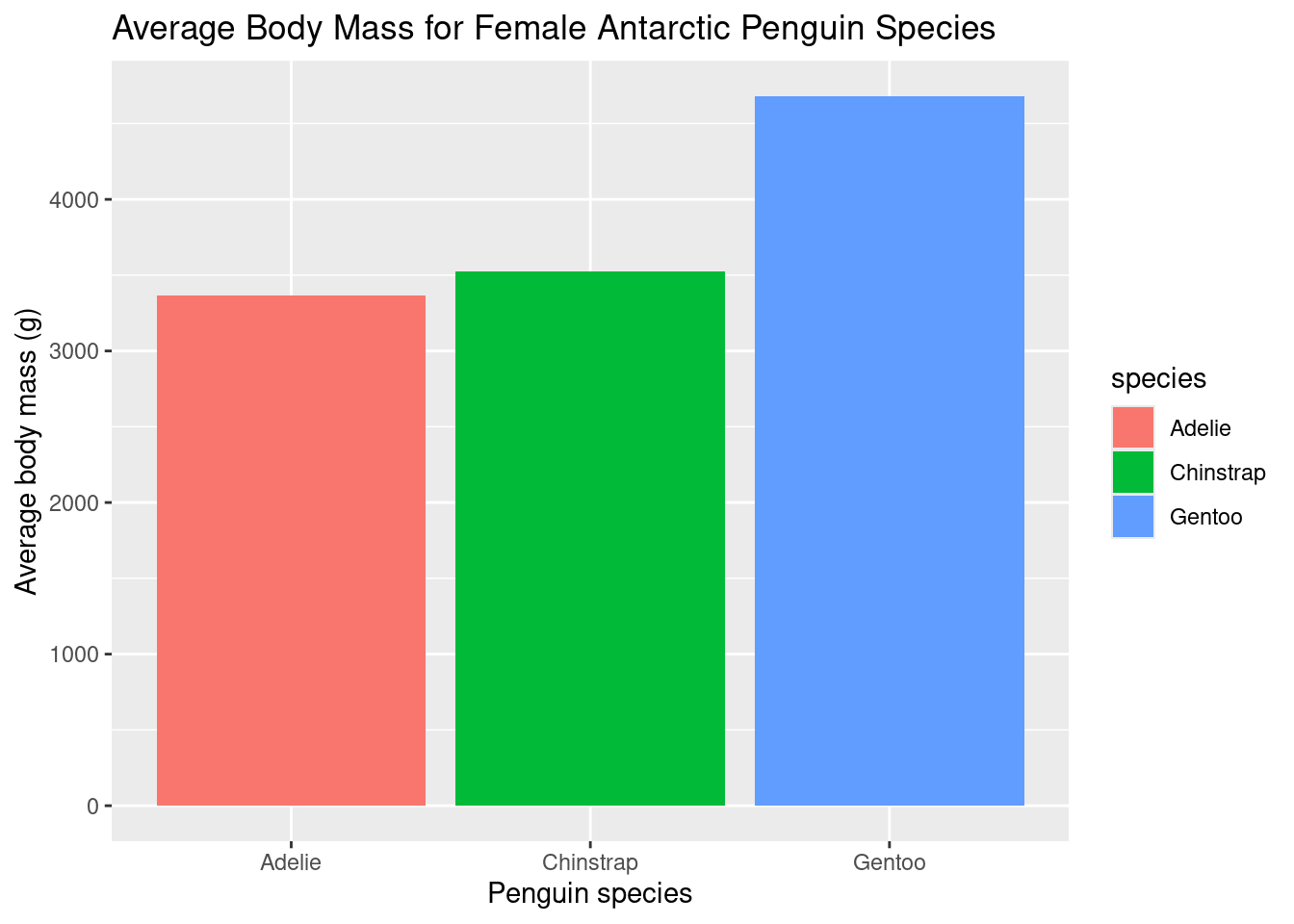
While the averages look different, we cannot be sure of how different they are. Averages are sensitive to outliers. For example, there is a possibility that most female Gentoo penguins have a body mass of 3000g, but there are a few penguins that exceed this value greatly, increasing the mean from the most common body mass.
To avoid this, we can add error bars to our bar graphs when representing averages. Error bars help represent the spread of data using a quantity known as the standard deviation. The standard deviation represents, on average, how much every data point is from the mean.
The error bars give a better gague on how similar groups are; if the error bars overlap, they are likely not statistically different. If the error bars do not overlap, they are likely statistically different. Further statistical analyses must be performed to confirm if they are statistically different.
The error bars extend from the top of the column plus and minus the standard deviation. Here is the same plot, with the error bars and the equations to calculate them.
Note: To create error bars, call on the geom_errorbar( ) function, with a nested mapping=aes( ), as shown
ggplot(data=femalePenguins, mapping = aes(x = species, y=avgBodyMass, fill = species))+
geom_bar(stat="identity")+
geom_errorbar(mapping=aes(ymin=avgBodyMass-sdBodyMass, ymax=avgBodyMass+sdBodyMass))+
labs(title="Average Body Mass for Female Antarctic Penguin Species", x="Penguin species", y="Average body mass (g)")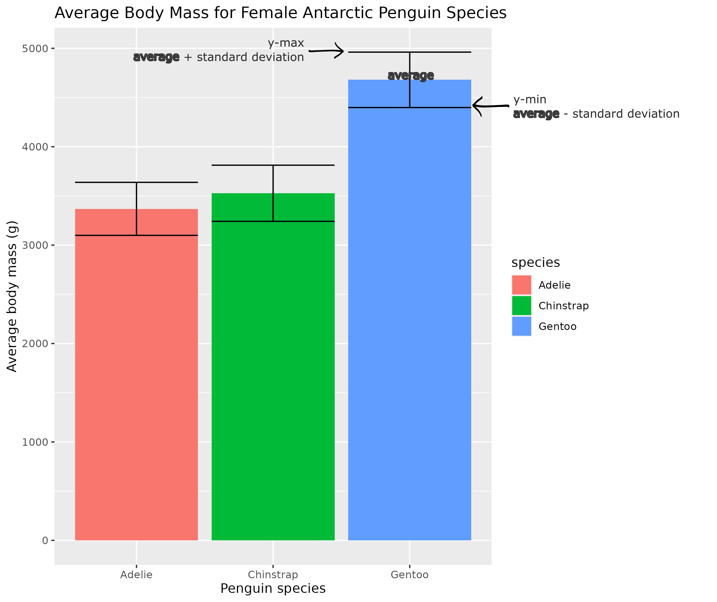 The error bars for the female Adelie and Chinstrap overlap, so they are likely not statistically different. However, the error bars for the Gentoo penguins have no overlap with the other Antarctic penguin species, so Gentoo penguins likely have a statistically signifcant difference in mass from other Antartic penguins in this dataset.
3 Chick Data
Now, using the ChickWeight data set, generate a plot that shows the average weight (variable: weight) of each of the four chick diets (variable: Diet).
First, let’s create a new subset of data from the ChickWeight data for the average weights using group by the chick diet and summarize their average weights. We can also summarize the standard deviation for the error bars in this plot.
Using the model code from above, plot a bar graph WITHOUT error bars.
Which variable is categorical (x-variable) and numerical (y-variable)? Make sure you are using the name for the new column of the average weight (avgWeight).
ggplot(data=avgChickWeight, mapping = aes(x = Diet, y=avgWeight))+
  geom_bar(stat="identity")
Are the chick weights for the diets different from one another? In order to check this, we can add error bars!
Using the sdWeight column from above, plot the same graph with error bars.
Remember: y-min SUBTRACTS the standard deviation from the mean and y-max ADDS the standard deviation to the mean.
ggplot(data=avgChickWeight, mapping = aes(x = Diet, y=avgWeight))+
  geom_bar(stat="identity")+
  geom_errorbar(mapping=aes(ymin=avgWeight-sdWeight, ymax=avgWeight+sdWeight))
It appears that each of the error bars overlap with one another, so there is no difference in the average weights of the chicks based on diet type in the ChickWeight data set.