Histograms
1 What is a histogram?
A histogram is a graph that compares the frequency (y-axis) of any categorical or numeric variable (x-axis). In other words, it measures how often a value from the x-axis appears in a data set.
Here is the framework of a histogram:
2 Penguin Data
In the penguin dataset, we can use a histogram to determine how often each bill depth (variable: bill_depth_mm) value appears in the dataset.
Here, there is a deviation from the ggplot framework in the home page. “bins” is used to tell R how many bars to create in your histogram. You can change this number as needed. Ideally, you want to keep the bin number large enough to see patterns in your data, but small enough to keep outliers to a minimum.
ggplot(data=penguins, mapping=aes(x=bill_depth_mm, na.rm=TRUE))+
  geom_histogram(bins=20)+
  labs(title="Distribution of Antarctic Penguin Bill Depth", x="Bill depth (mm)", y="Frequency")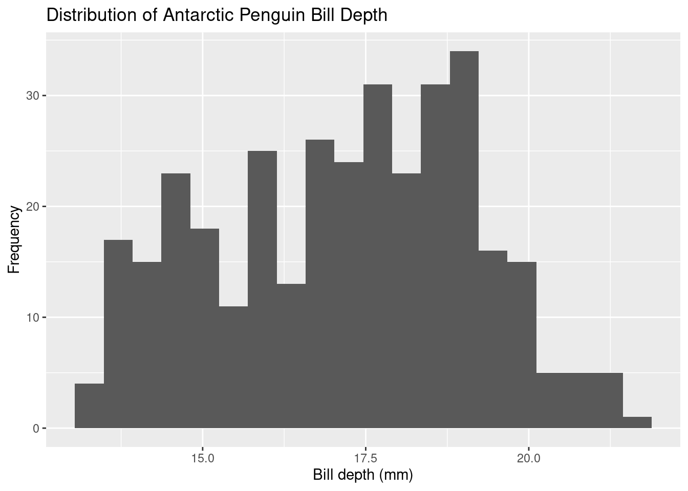
This data is pretty noisy. There appears to be three peaks. There are three species of penguins in this data set. Perhaps each peak represents each species?
Let’s see if there is a trend in Gentoo penguins.
First, we must filter the penguin data to include only Gentoo penguins by creating a new variable, “gentooPenguins”.
Now let’s create a histogram of the distribution of Gentoo penguin bill depths. Don’t worry about adding a title or axes labels!
R is case sensitive! The data set is named “gentooPenguins” and the variable is “bill_depth_mm”.
ggplot(data=gentooPenguins, mapping=aes(x=bill_depth_mm, na.rm=TRUE))+
  geom_histogram(bins=20)
This data still appears to show no clear pattern. Perhaps there is no trend in bill depth for Gentoo penguins in the data provided.
3 Chick Data
Let’s try using the ChickWeight data set! Using the model code above, create a histogram to see the distribution of chick weights (variable “weight”) using the ChickWeight dataset.
R is case sensitive! The data set is named “ChickWeight” and the variable is “weight”.
ggplot(data=ChickWeight, mapping=aes(x=weight, na.rm=TRUE))+
  geom_histogram(bins=20)
How is the data distributed? Are there more chicks that fall into a weight interval to the left of the graph, to the right of the graph, or is it normally distributed?
The histogram is right skewed, meaning throughout the data, most chicks’ weights fall between 0-100g.