Scatter Plots
1 What is a scatter plot?
A scatter plot compares both a numerical values on the x and y axes. They can be used to show trends over time, or to show the correlation between two variables.
Here is the plot framework:
2 Penguin Data
In the penguin data set, we can examine the relationship between bill depth and bill length.
Note: To generate a scatter plot, we call on the geom_point( ) function with ggplot.
ggplot(data=penguins, mapping=aes(x=bill_length_mm, y=bill_depth_mm))+
  geom_point()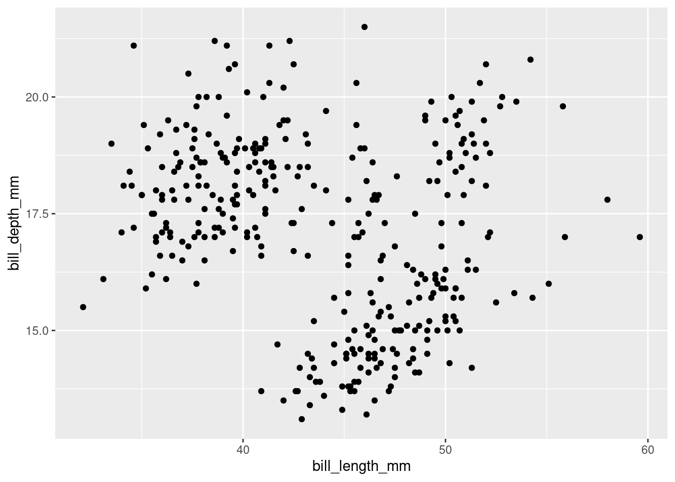
3 Line of best fit
So we have these dots, but how do we know the relationship between x and y-variables?
In order to perform regression analysis, or how the x and y variables are related, we can use a linear model equation y=mx + b, where y is a function of the change in a given y-value times its respective x-value, plus the y-intercept, or where the y-value crosses the y=0 axis.
All this information can be found using this skeletal formula:
variable=lm(data = df, fomula = y-variable ~ x-variable)
summary(variable)
Here is the skeletal fomula applied to our scatter plot of the penguin bill depth vs. bill length. Below is the output: the summary statistics associated with this linear model.
billDepthAndLengthModel=lm(data=penguins, formula=bill_depth_mm~bill_length_mm)

summary(billDepthAndLengthModel)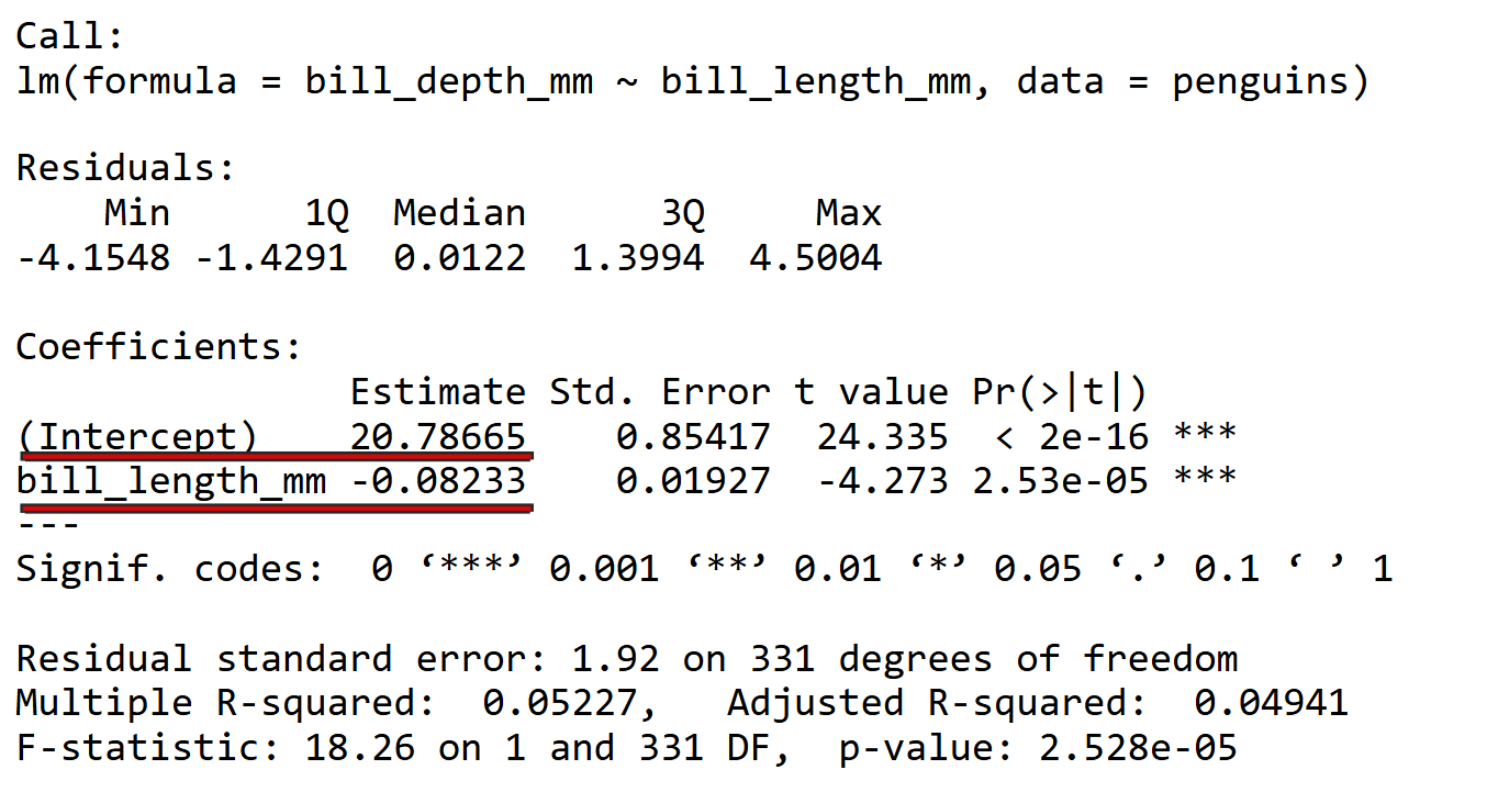
While this output is intimidating, we only need two numbers for our purposes: the estimate intercept (b) and the slope (m), located right below that number.
Our line of regression can be represented in the equation y = -0.08502x + 20.88574
Here is the same scatter plot with the line of best fit:
ggplot(data=penguins, mapping=aes(x=bill_length_mm, y=bill_depth_mm))+
  geom_point()+
  geom_smooth(method="lm")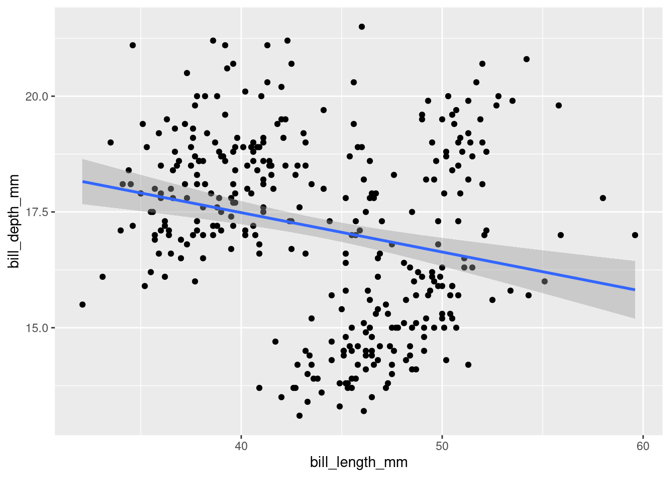
4 Chick Data
Using the ChickWeight data set, that shows the the change in weight (variable: “weight”) over time in days (variable: “Time”) for chick 4.
First, we must filter the ChickWeight data to include only data from chick 4 by creating a new variable, “chick4”.
Now let’s create a scatter plot of chick 4’s weight over time. Don’t worry about adding a title or axes labels. Make sure to add a line of best fit!
R is case sensitive! The data set is named “ChickWeight” and the variables are “Time” and “weight”. Which variable belongs on the x-axis? Which variable belongs on the y-axis.
ggplot(data=chick4, mapping=aes(x=Time, y=weight))+
  geom_point()+
  geom_smooth(method=lm)
Let’s generate the line of best fit summary table for the chick4 data, using the model code from above.
Write the linear regression equation (y=mx+b) based on the summary model.
Make sure you have the slope and y-intercept in their respective spots!
This equation shows the relationship between the x-variable (time) and the y-variable (weight) for chick 4 from the ChickWeight data set.