ggplot(data=penguins, mapping=aes(x=bill_depth_mm, na.rm=TRUE, fill=species))+
geom_histogram(bins=20)+
labs(title="Distribution of Antarctic Penguin Bill Depth", x="Bill depth (mm)", y="Frequency")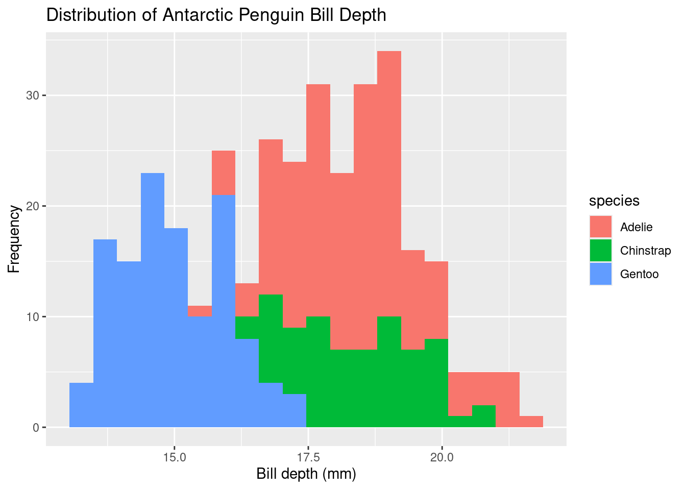
Here are some tools that can improve your data visualizations
Colors can be used as a tool to emphasize an idea on a graph. To change the color of the points/lines on your graph, select the color you want using color=” “ in the function specifying the graph type. For example, to change the default black points in a scatter plot to blue,
ggplot(data=dataset, mapping=aes(x=xVariable, y=yVariable))+
geom_point(color="blue"))
There are many colors to choose from, but it is important to consider how your audience would perceive them. Are they bright and straining? Are they accessible to someone who has visual impairments?
Fill is an argument that is useful in generating a plot with multiple categorical variables at once. In the first plot example from the “Histogram” subsection, there appeared to be three peaks in the overall penguin data. Using the “fill=species” argument, as shown below, we can see the frequency of penguin weights based on species.
Below is the same code used from the tutorial, with the addition of the “fill=species” argument.
ggplot(data=penguins, mapping=aes(x=bill_depth_mm, na.rm=TRUE, fill=species))+
  geom_histogram(bins=20)+
  labs(title="Distribution of Antarctic Penguin Bill Depth", x="Bill depth (mm)", y="Frequency")
Using the fill argument, it is easier to see how the frequency of weight varies with penguin species.
Facet wrap is a function that can display multiple data visualizations at once. It is used to show graphs with the same axes with a change in a categorical variable. For example, we can compare the weights of all three Antarctic penguin species in one data visualization. It’s useful when trying to compare data, without creating a visually busy graph.
To do this, call on the facet_wrap( ) function and inside the parentheses, specify the categorical variable using a tilde (~).
ggplot(data=penguins, mapping=aes(x=bill_length_mm, y=body_mass_g))+
  geom_point()+
  facet_wrap(~species)+
  labs(title="Bill length by body mass for Antarctic Penguin Species", x="Bill length (mm)", y="Body mass (g)")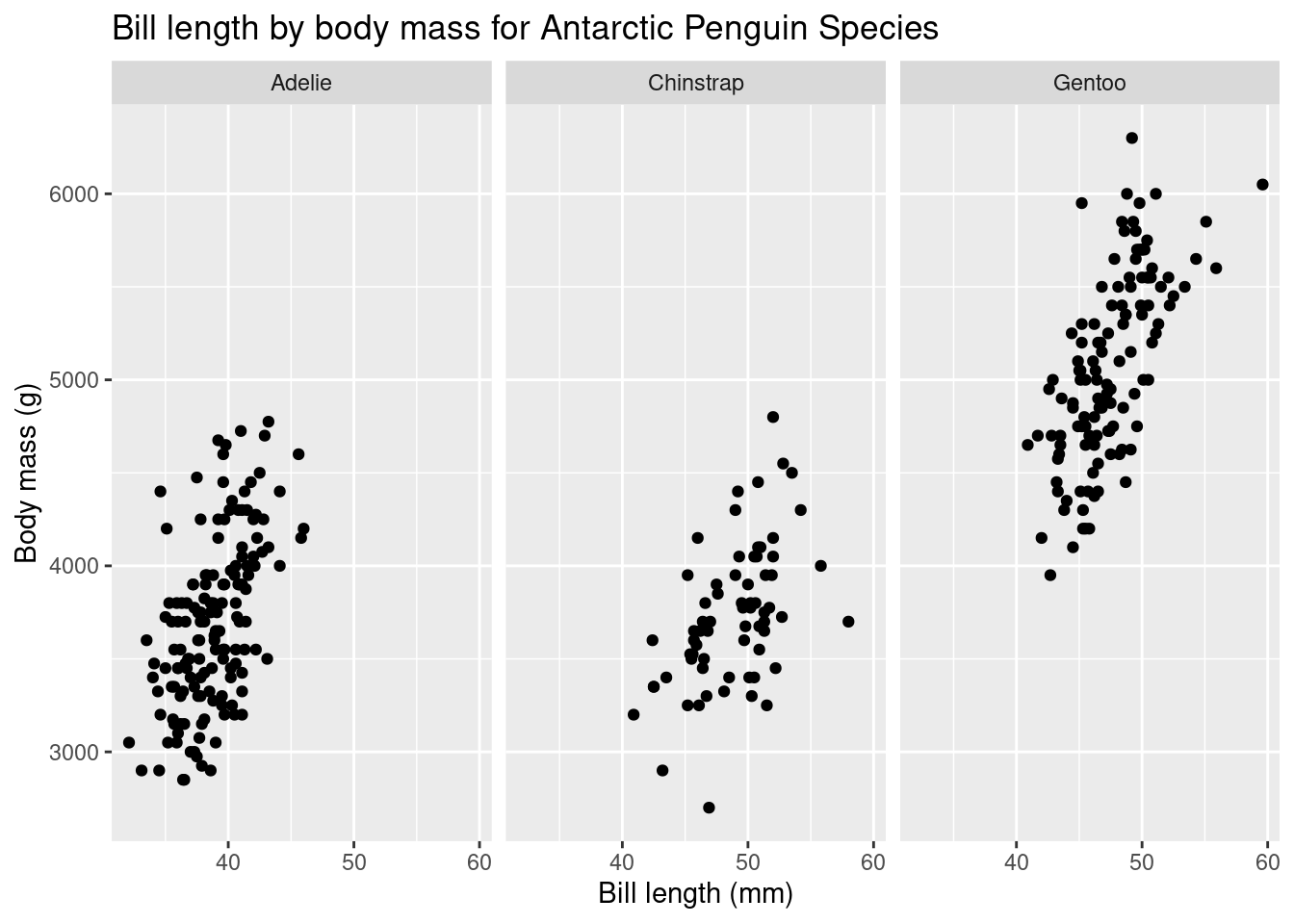
As mentioned, error bars are a helpful tool to show if different categorical variables are distinct from one another. You can edit the size of its size and color by specifying these within the geom_errorbar( ) function. Below is the same code chunk from the Bar Plot tutorial comaring the body mass of different Antarctic female penguins.
As a reminder, here is the subset of data we created, called “femalePenguins”.
This code chunk includes “width = 0.5” to make the error bars smaller.
You can change the boldness of the error bars by instead using the “linewidth=” argument, or changing the color using “color=”. Try editing the chunk above to create your own plot!